Let \(\rho_{XY}\) be the correlation between the stochastic variables \(X\) and \(Y\) and similarly for \(\rho_{XZ}\) and \(\rho_{YZ}\). If we know two of these, can we say anything about the third?
In a recent blog post I dealt with the problem mathematically and I used the concept of a partial correlation coefficient. Here I will take a simulation approach.
First z is simulated. Then x and y is simulated based on z
in a regression context with a slope between \(-1\) and \(1\).
The sign of the slope together with the variance of the error term
determine the correlation.
library(tidyverse)
library(patchwork)
theme_set(theme_bw())

sample_size <- 100

set.seed(1)

# First z is sampled
z <- rnorm(n = sample_size, mean = 0, sd = 1)

# Then x
slope_x <- runif(n = 1, min = -1, max = 1)
sd_error_x <- runif(n = 1, min = 0.001, max = 2)
x <- slope_x*z + rnorm(n = sample_size, mean = 0, sd = sd_error_x)

# And the y:
slope_y <- runif(n = 1, min = -1, max = 1)
sd_error_y <- runif(n = 1, min = 0.001, max = 2)
y <- slope_y*z + rnorm(n = sample_size, mean = 0, sd = sd_error_y)
This gives us:
p_xz <- ggplot() + geom_point(aes(x, z))
p_yz <- ggplot() + geom_point(aes(y, z))
p_xz + p_yz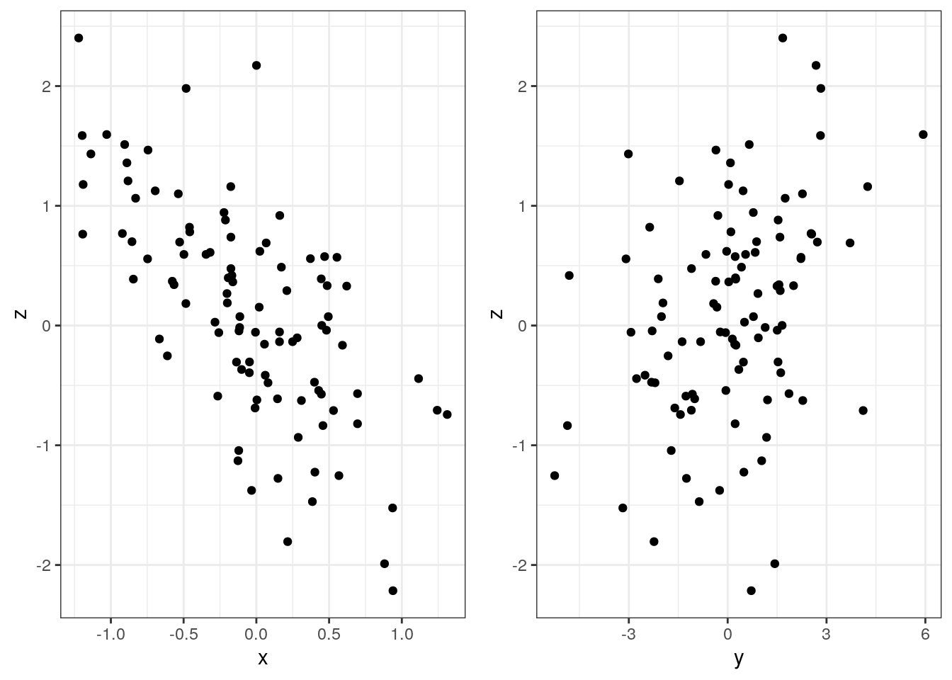
Now we know the correlation between \(x\) and \(z\) as well as between \(y\) and \(z\). But we do not know it between \(x\) and \(y\), but we can calculate it.
cor(x, z)
## [1] -0.6728867
cor(y, z)
## [1] 0.3551803
cor(x, y)
## [1] -0.1818432
Let us perform the simulation many, many times:
set.seed(1)
num_sims <- 100000
sim_res <- replicate(n = num_sims, expr = {
  # First z is sampled
  z <- rnorm(n = sample_size, mean = 0, sd = 1)

  # Then x
  slope_x <- runif(n = 1, min = -1, max = 1)
  sd_error_x <- runif(n = 1, min = 0.001, max = 2)
  x <- slope_x*z + rnorm(n = sample_size, mean = 0, sd = sd_error_x)

  # And the y:
  slope_y <- runif(n = 1, min = -1, max = 1)
  sd_error_y <- runif(n = 1, min = 0.001, max = 2)
  y <- slope_y*z + rnorm(n = sample_size, mean = 0, sd = sd_error_y)

  return(c("rXZ" = cor(x, z), "rYZ" = cor(y, z), "rXY" = cor(x, y)))
})
We then make the illustration:
d <- t(sim_res) %>% as_tibble() %>%
  mutate(rXY_sign = as.character(sign(rXY)))

p <- ggplot(d, aes(rXZ, rYZ, color = rXY_sign)) +
  geom_point(alpha = 0.1) +
  scale_color_manual(expression(paste("Sign of ", rho[XY])),
                    values = c("-1" = "red", "1" = "blue")) +
  labs(x = expression(rho[XZ]),
       y = expression(rho[YZ])) +
  coord_equal()
p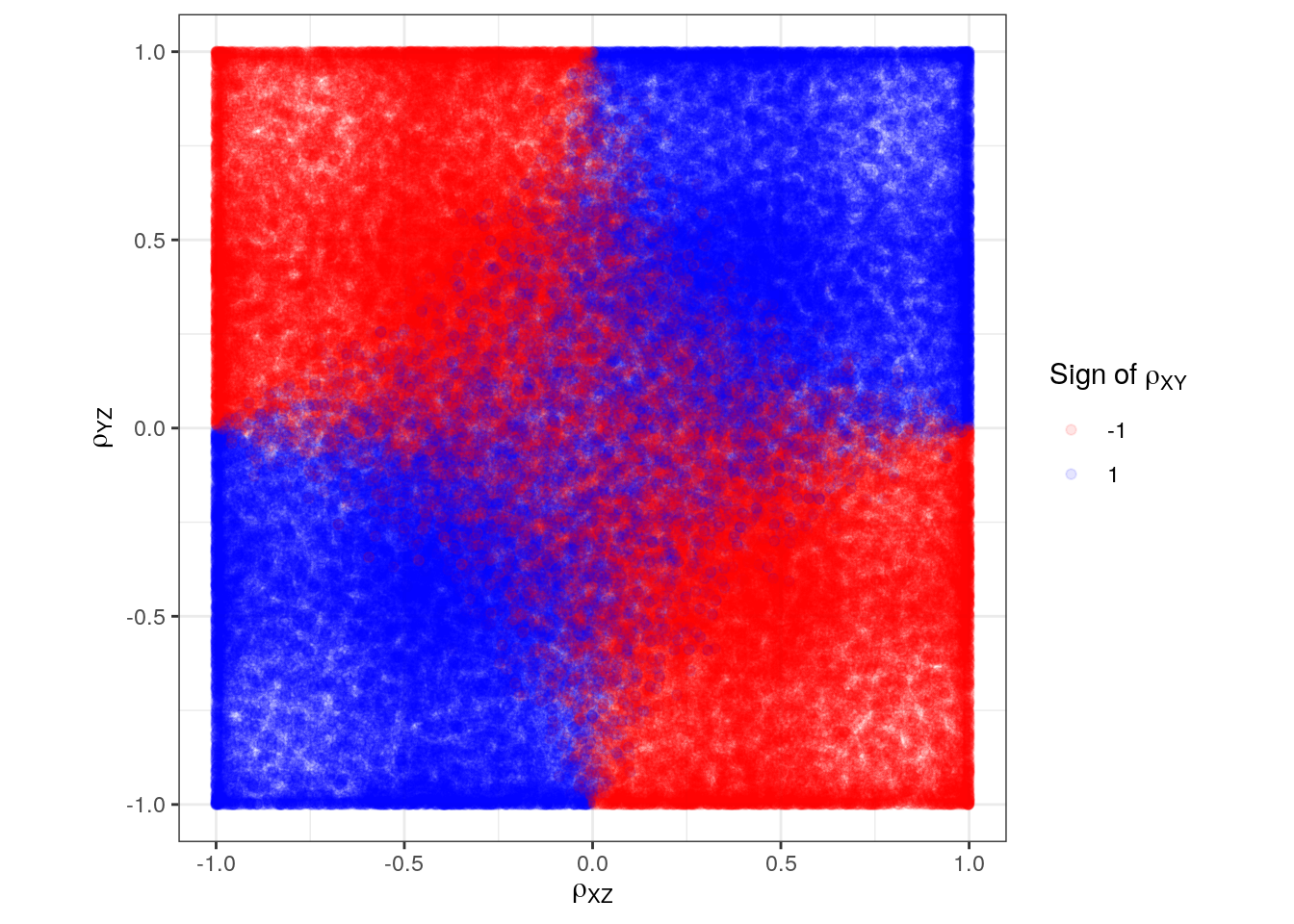
It can be difficult to see because of possible overplotting so we divide points into small bins and compute the different signs in each bin:
n_bins <- 50
d_binned <- d %>%
  mutate(
    rXZ_grp = cut(rXZ, breaks = n_bins),
    rYZ_grp = cut(rYZ, breaks = n_bins)
    ) %>%
  group_by(rXZ_grp, rYZ_grp) %>%
  summarise(
    rXZ = mean(rXZ),
    rYZ = mean(rYZ),
    n = n(),
    rXY_sign = case_when(
      all(sign(rXY) == -1) ~ "-1",
      all(sign(rXY) == 1) ~ "1",
      TRUE ~ "?"
  ))
d_binned
## # A tibble: 2,500 x 6
## # Groups:   rXZ_grp [50]
##    rXZ_grp    rYZ_grp          rXZ    rYZ     n rXY_sign
##    <fct>      <fct>          <dbl>  <dbl> <int> <chr>
##  1 (-1,-0.96] (-1,-0.96]    -0.987 -0.986   128 1
##  2 (-1,-0.96] (-0.96,-0.92] -0.988 -0.943    60 1
##  3 (-1,-0.96] (-0.92,-0.88] -0.987 -0.901    56 1
##  4 (-1,-0.96] (-0.88,-0.84] -0.988 -0.862    54 1
##  5 (-1,-0.96] (-0.84,-0.8]  -0.983 -0.819    54 1
##  6 (-1,-0.96] (-0.8,-0.76]  -0.987 -0.780    52 1
##  7 (-1,-0.96] (-0.76,-0.72] -0.986 -0.742    42 1
##  8 (-1,-0.96] (-0.72,-0.68] -0.989 -0.699    58 1
##  9 (-1,-0.96] (-0.68,-0.64] -0.986 -0.659    61 1
## 10 (-1,-0.96] (-0.64,-0.6]  -0.988 -0.620    71 1
## # … with 2,490 more rows
p <- ggplot(d_binned, aes(rXZ, rYZ, fill = rXY_sign)) +
  geom_tile(width = 0.05, height = 0.05) +
  scale_fill_manual(expression(paste("Sign of ", rho[XY])),
                  values = c("-1" = "red", "1" = "blue", "?" = "grey")) +
  labs(x = expression(rho[XZ]),
       y = expression(rho[YZ])) +
  coord_equal()
p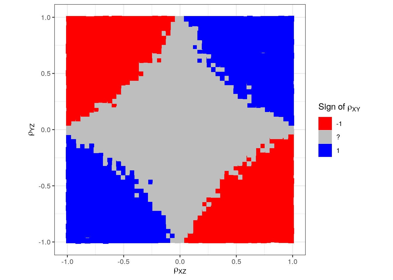
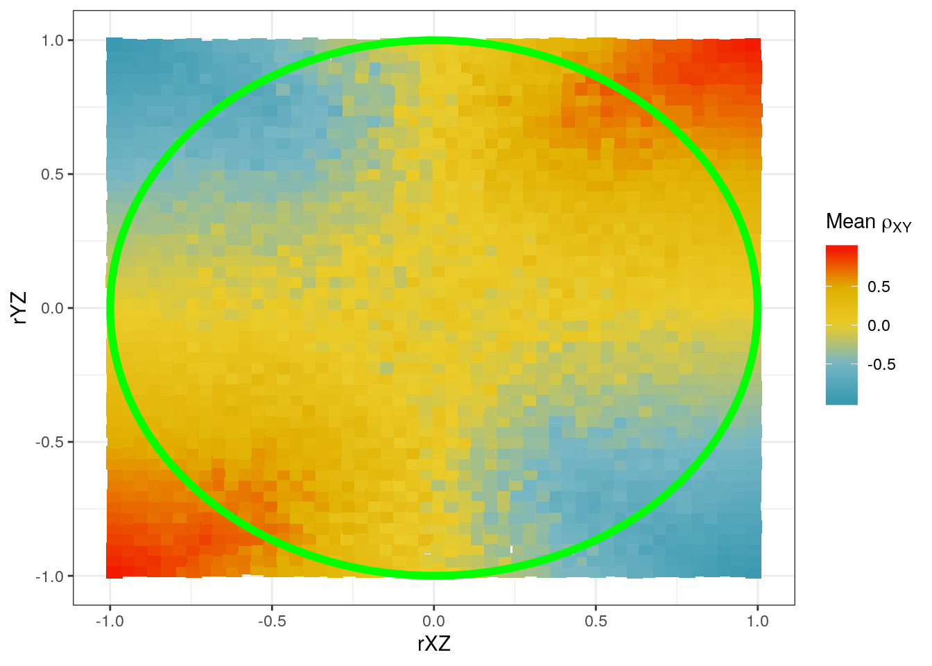
We know from the previous blog post that we expect uncertainty about the sign inside the unit circle and certainty outside. Let us draw the unit circle on this, too:
p + annotate("path",
             x = cos(seq(0, 2*pi, length.out = 100)),
             y = sin(seq(0, 2*pi, length.out = 100)),
             color = "green", size = 2)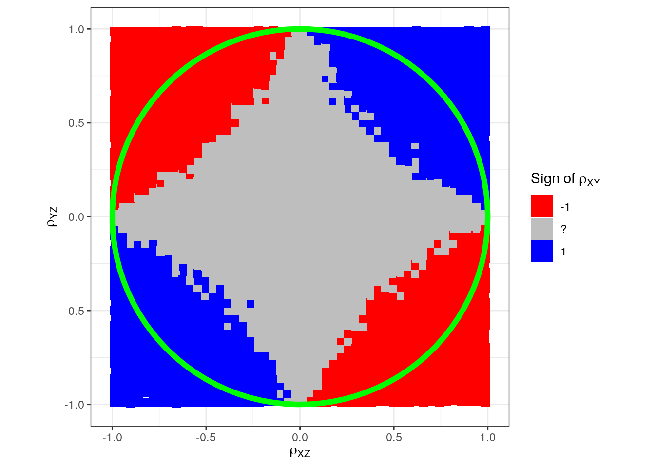
Somehow we have difficulty in sampling varying signs in the corners just inside the circle. (Maybe we need another simulation model.) This could potentially lead us to believe that instead of a circle, we would have a square:
p + annotate("path",
             x = cos(seq(0, 2*pi, length.out = 100)),
             y = sin(seq(0, 2*pi, length.out = 100)),
             color = "green", size = 2, alpha = 0.5) +
  annotate("segment", x = -1, xend = 0, y = 0, yend = 1, colour = "green", size = 2) +
  annotate("segment", x = 0, xend = 1, y = 1, yend = 0, colour = "green", size = 2) +
  annotate("segment", x = 1, xend = 0, y = 0, yend = -1, colour = "green", size = 2) +
annotate("segment", x = 0, xend = -1, y = -1, yend = 0, colour = "green", size = 2) 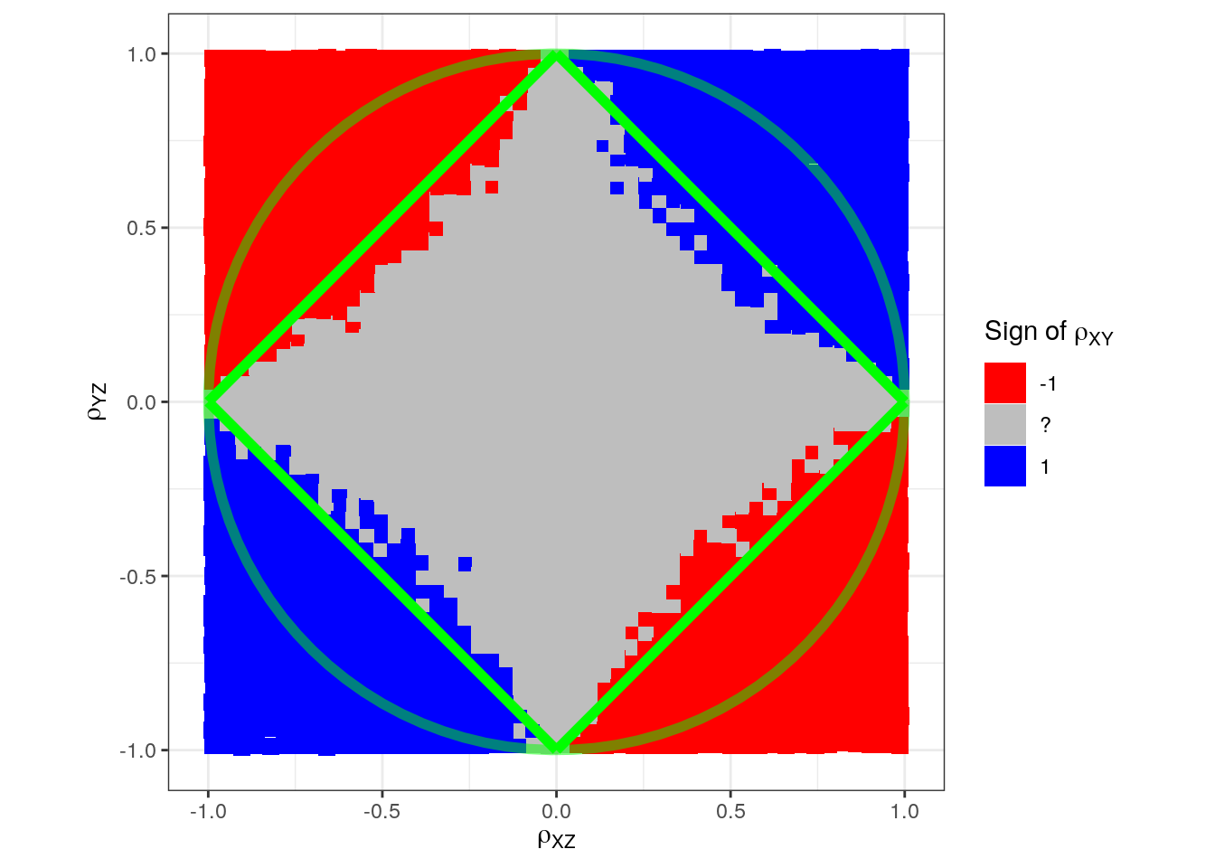
This illustrates that one must be a bit cautious with blindly relying on simulation results unless the simulation mechanism and data-generating process is well-understood.
Let us try to fix that: Instead of simlating \(x\) and \(y\) separately (depending only on \(z\)), we now allow for \(y\) to also depend on \(x\):
set.seed(1)
num_sims <- 100000
sim_res <- replicate(n = num_sims, expr = {
  # First z is sampled
  z <- rnorm(n = sample_size, mean = 0, sd = 1)

  # Then x
  slope_x <- runif(n = 1, min = -1, max = 1)
  sd_error_x <- runif(n = 1, min = 0.001, max = 2)
  x <- slope_x*z + rnorm(n = sample_size, mean = 0, sd = sd_error_x)

  # And the y:
  slope_x <- runif(n = 1, min = -1, max = 1) # new line
  slope_y <- runif(n = 1, min = -1, max = 1)
  sd_error_y <- runif(n = 1, min = 0.001, max = 2)
  # Extra term: "slope_x*x"
  y <- slope_x*x + slope_y*z + rnorm(n = sample_size, mean = 0, sd = sd_error_y)

  return(c("rXZ" = cor(x, z), "rYZ" = cor(y, z), "rXY" = cor(x, y)))
})
n_bins <- 50
d_binned <- t(sim_res) %>%
as_tibble() %>%
mutate(
rXZ_grp = cut(rXZ, breaks = n_bins),
rYZ_grp = cut(rYZ, breaks = n_bins)
) %>%
group_by(rXZ_grp, rYZ_grp) %>%
summarise(
rXZ = mean(rXZ),
rYZ = mean(rYZ),
n = n(),
rXY_sign = case_when(
all(sign(rXY) == -1) ~ "-1",
all(sign(rXY) == 1) ~ "1",
TRUE ~ "?"),
rXY = mean(rXY),
)
p <- ggplot(d_binned, aes(rXZ, rYZ, fill = rXY_sign)) +
geom_tile(width = 0.05, height = 0.05) +
scale_fill_manual(expression(paste("Sign of ", rho[XY])),
values = c("-1" = "red", "1" = "blue", "?" = "grey")) +
labs(x = expression(rho[XZ]),
y = expression(rho[YZ])) +
coord_equal()
p + annotate("path",
x = cos(seq(0, 2*pi, length.out = 100)),
y = sin(seq(0, 2*pi, length.out = 100)),
color = "green", size = 2)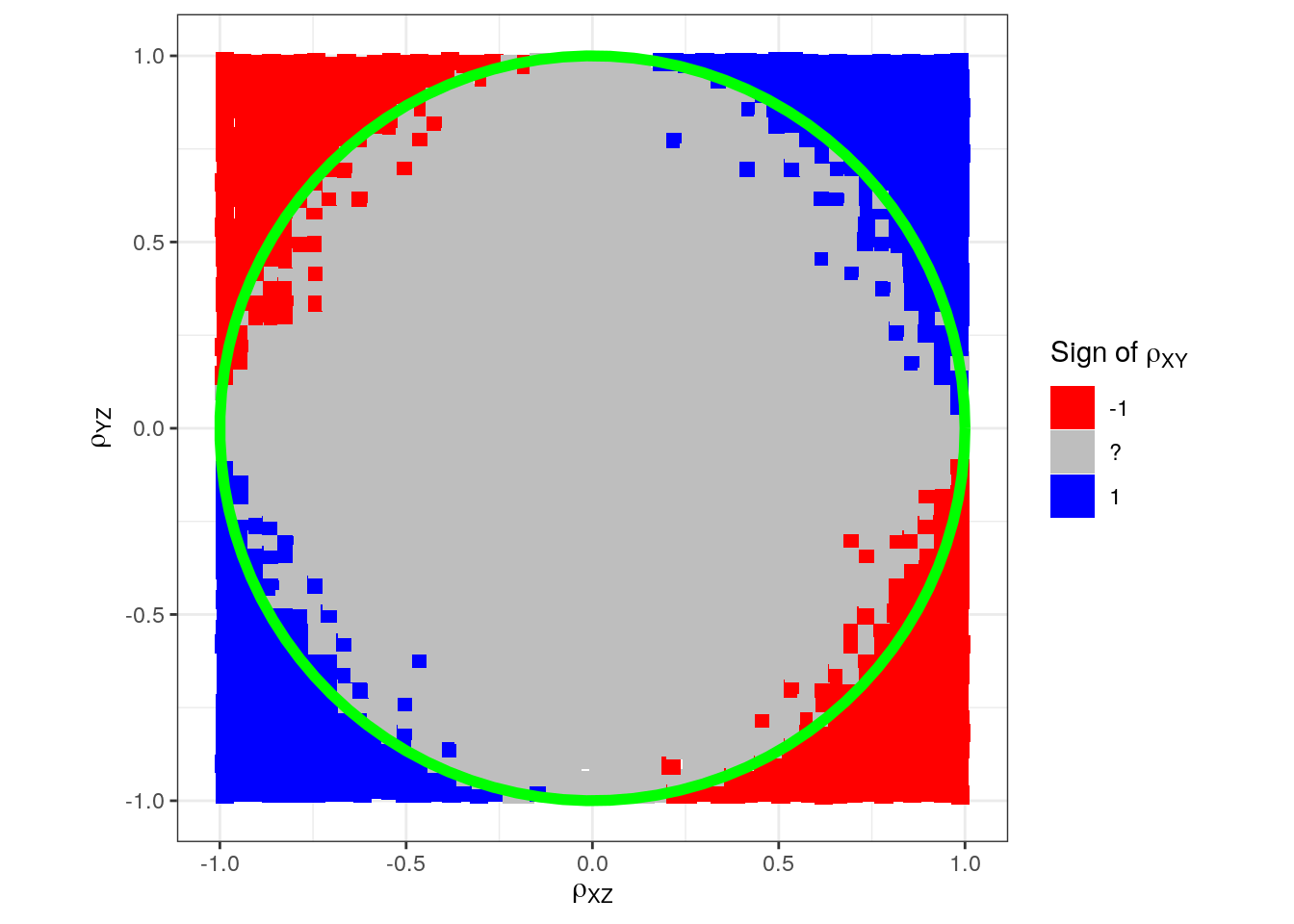
Instead of coloring according to sign only, we can color it according to the mean correlation in each small area:
library(wesanderson) # for wes_palette
p <- ggplot(d_binned, aes(rXZ, rYZ, fill = rXY)) +
  geom_tile(width = 0.05, height = 0.05) +
  scale_fill_gradientn(expression(paste("Mean ", rho[XY])),
                       colours = wes_palette("Zissou1", 100, type = "continuous"))
  labs(x = expression(rho[XZ]),
       y = expression(rho[YZ])) +
  coord_equal()
## NULL
p + annotate("path",
             x = cos(seq(0, 2*pi, length.out = 100)),
             y = sin(seq(0, 2*pi, length.out = 100)),
             color = "green", size = 2)